Loading...
loading...
Search for a command to run...
Learn how to create a awesome & beautiful card component with css hover effects using html and css only
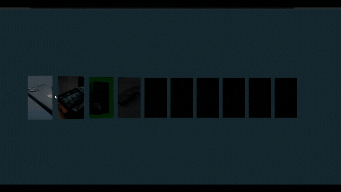
To create this kind of awesome animated card UI using html & CSS only you will need to follow these steps.
In the root of the project create a basic index.html file and paste this code.
<!DOCTYPE html>
<html lang="en">
  <head>
    <meta charset="UTF-8" />
    <meta name="viewport" content="width=device-width, initial-scale=1.0" />
    <link rel="stylesheet" href="style.css">
    <title>Card hover effects using HTML, CSS</title>
  </head>
  <body>
    <main>
      <div class="list">
        <div class="item"><img src="./img/1.webp" alt="" /></div>
        <div class="item"><img src="./img/2.webp" alt="" /></div>
        <div class="item"><img src="./img/3.webp" alt="" /></div>
        <div class="item"><img src="./img/4.webp" alt="" /></div>
        <div class="item"><img src="./img/5.webp" alt="" /></div>
        <div class="item"><img src="./img/6.webp" alt="" /></div>
        <div class="item"><img src="./img/7.webp" alt="" /></div>
        <div class="item"><img src="./img/8.webp" alt="" /></div>
        <div class="item"><img src="./img/9.webp" alt="" /></div>
        <div class="item"><img src="./img/10.webp" alt="" /></div>
      </div>
    </main>
  </body>
</html>
Then next
Create a basic style.css with the index.html file then paste the following code in style.css
* {
    padding: 0;
    margin: 0;
}

body {
  display: flex;
  align-items: center;
  height: 100vh;
  background: #16242b;
  justify-items: center;
}

main {
  width: 100%;
  height: 100%;
  display: grid;
  align-content: center;
}

.list {
  display: flex;
  justify-items: center;
  justify-content: center;
  align-items: center;
  align-content: center;
  transform-style: preserve-3d;
  transform: perspective(1000px);
}

.item {
  padding: 0 0.5rem;
  display: flex;
  height: 100%;
}

.list .item {
  transition: 0.5s;
  filter: brightness(0);
}

.list .item:hover {
  filter: brightness(1);
  transform: translateZ(200px);
}
.list .item:hover + * {
  filter: brightness(0.6);
  transform: translateZ(150px) rotateY(40deg);
}

.list .item:hover + * + * {
  filter: brightness(0.4);
  transform: translateZ(70px) rotateY(20deg);
}

.list .item:hover + * + * + * {
  filter: brightness(0.2);
  transform: translateZ(30px) rotateY(10deg);
}
.list .item:has(+ *:hover) {
  filter: brightness(0.6);
  transform: translateZ(150px) rotateY(-40deg);
}

.list .item:has(+ * + * :hover) {
  filter: brightness(0.4);
  transform: translateZ(70px) rotateY(-20deg);
}

.list .item:has(+ * + * + *:hover) {
  filter: brightness(0.2);
  transform: translateZ(30px) rotateY(-10deg);
}

.item > img {
  width: 100px;
  object-fit: cover;
  aspect-ratio: 9 / 16;
  object-position: center;
}
If you want to learn step by step process about creating this animation then you can follow this Youtube video here
Here's the GitHub's repo link


